My Scrapbook Goals and How I'm Doing

Showing posts with label School. Show all posts

Tuesday, October 6, 2009

I'm A Winner!!

I've been a follower of Vicki of A Work in Progress Designs for quite a while. She now has her own store Scrap That Idea. As part of the store she remade her old freebie kit Blue Jeans with a revamped Funky Blue Jeans. To promote the new kit she had a challenge. Take a layout you made with the original Blue Jeans kit and remake it with the new Funky Blue Jeans kit. So I decided to take the challenge. There were only 4 entries but I won. I'm so excited.

My first layout was completed about a year ago. It was for our school album. No template was used. The fonts were Calibri and Tubular.

The remake is for the family album. I used fewer photos in the remake. I used the new Funky Blue Jeans kit. A template by Dani Alencar. The font is Adorable.

If you like this blue jean look you can pick up Funky Blue Jeans for your self HERE at Scrap That Idea.

Saturday, October 3, 2009

Throwing Some Scraps Around - In the Schoolhouse Now


Worked with this great kit today. It is full of wonderful bold primary colors plus lots of fun school time elements. I loved the chalkboard and chalk elements the best. They are wonderful for journaling.

I created two layouts with this In the Schoolhouse Now by Throwing Some Scraps Around. If you like it you can pick up HERE at DigiScrap Station.

The first layout is Wacky Graduation 06. It features the graduation from the Camp Fire Summer program. I used the font School Hand Bold Italic from Creative Chaos.

The second layout is School Time and features the two youngest boys on a field trip to the local historic park. The boys got to experience school in the 1880's. I used one of Managirl's templates and the font Century Schoolbook.

Wednesday, September 9, 2009

Throwing Some Scraps Around - Wild and Wacky


This is a bright kit and perfect for all kinds of themes or activities. It includes lots of fun animal elements and the date stamp element is really easy to use. You can pick up Wild and Wacky by Throwing Some Scraps Around HERE at DigiScrap Station.

I created two great layouts with this kit. The first layout is Testing Time. It was from a trip to St. Pete for school testing. The kids had a lot of fun staying at the hotel and getting to go spend their gift certificates at Target. I used an Andrea Gold template and the font Drummon Bold Italic.

The second layout was from pictures taken that same trip. The gang was really excited about getting to eat at Chili's. They all felt they had something remarkable about their meal and wanted photographic proof. I used another Andrea Gold template and the font. Gill Sans MT.

Thursday, September 3, 2009

Took the DigiDare Challenge


Every week I look at the DigiDare blog and each week I say that looks cool and I'm going to try and then in the end I don't seem to get it done. Well this week just before it was too late I actually took the time to complete the challenge. You can find out more about them at We Dare You.

This weeks was to scrap about your favorite teacher. I chose my third grade teacher Mrs. Joan Hammil. The kit I used was Aussie Caz's Back to School. You can check out a previous post for the preview of this great kit. Or you can check out Back to School at the DigiScrap Station store. I used my two favorite school handwriting fonts School Hand and School Hand Italic both in Bold from Creative Chaos. I've used them quite a bit lately so I decided I'd better share a link for you. Creative Chaos' School Hand Font Family at Commercial Use.com.

Tuesday, September 1, 2009

Aussie Caz Design - Back to School


Why this is a great school and just in time for those back to school photos. I love the bold primary colors and the blackboard elements are really cute. You can purchase Back to School by Aussie Caz Design HERE at DigiScrap Station.

I created two great layouts with this kit. The first layout was created using the September Template Challenge from DigiScrap Shop. You can get details and play along HERE. I used School Hand Bold Italic by Creative Chaos. It features some of the things my son built while waiting for his testing in 2006.

The second layout is also from 2006 and features by gang doing school. It uses School Hand Bold by Creative Chaos.

Friday, March 20, 2009

CT Kathy's Scraps - St. Patty's Day


This is a great kit for those St. Patty's Day pictures. You haven't scrapped them yet make sure you go pick up this great kit now. I loved all the little elements.

I created a great two page layout from the St. Patty's Day party we attended the other day. The kids had a lot of fun at the party and I had a lot of fun creating this layout. I used a double page template from Yin Design. The fonts are Arial and Myriad Pro.

You can get this great kit - St. Patty's Day HERE.

Friday, January 30, 2009

CT for Stacey Crossley - Spring Fling


Stacey has a brand new kit in the store and its a lot of fun. It has some great elements including clips, ribbons, and buttons. I love the journal mat that comes with this kit. I completed 1 double page layout and 1 single page layout with this great kit.

Double page layout features story time at our library that I submitted for a Holiday Layout at Scraphead. Our holiday Pooh's Day. The library had a bear themed program in honor of Pooh. I used a double template by Andrea Gold. The font is Vagabound.

The single page features a layout of Caleb's dog Faithful helping him out with his chores. She's such a sweetheart of a dog. I used the sketch for the Scraphead Sketch challenge and submitted it. The font is Tristan.

You can pick up Spring Fling HERE.

Wednesday, September 10, 2008

A Day Fishing Kit Part 2


Here's the second installment of the A Day Fishing Kit. This installment has two downloads. One for most of the elements and one for the word art and frames. I'm also including the second page I created with this kit.


Here are the links:

A Day Fishing Elements

A Day Fishing Frames and Words

Saturday, September 6, 2008

A Day Fish Kit Part 1

OOPSSSS - I messed up and accidently published this too soon. But you benefit from my mistake and get an earlier chance at the paper. The other items will come out as scheduled so be patient the rest will be out next week.
-------------------------------------

I have finished another kit. I hope you enjoy it. The idea was came from a day a few weeks ago when I went with my husband and two youngest to go fishing. I found some great shots for texture overlays and one thing led to another and a kit was born. This kit will be released in 3 parts. Part One released today will include the Paper. Part 2 will be the Two Element Files. Part Three will be a QP and Brag Book Page.

And as we are watching two more tropical systems that might impact Florida over the next week or so I'm going to upload and set up automatic blog release. I am included the 1st of a two page layout using the kit and the paper preview.

A Day Fishing Paper

Monday, September 1, 2008

Using Kits in Non-Traditional Ways


First you will notice that I'm making progress again on my layout count but I'm still a long way from my goal. But the really exciting news is that I have caught up on all my school albums. Yippee. Now I have to decided were to focus my attention next.

The first layout reflect yet another year of the Kid's Choir pool party. When you do the same event year after year it gets harder to keep it fresh. So I decided to change this up this year by not choosing a summer or water themed kit. I thought this kit from SAS's Darlene Haughn Girlicious fit the bill. I really like the results. The font is Arial Black.

The second layout features a kit that was very patriotic in nature and used it for this bright library time layout. The multicolors in the base paper seemed to reflect the multicultural theme this year. And the journal paper made a great journal box. I extracted the African performers to make really highlight how active their show was. The kit is an old one from Valerie Ostrom called Solider of WW2. The font was Book Antique.

Getting Clever When Your Photos are So-So

A new goal for my layouts on this blog is not to share every layout I do but to focus on layouts that either highlight an interesting technique like the ones below, reflect work I've done as a Creative Team member, or are special to me for a variety of reasons. I'll put a link up soon on the side bar of my gallery where I display all my layouts if you would like to see more of my work. That way the blog can highlight both my design freebies, the work of the great designers I work for, or things that will help others out.

I had a couple of events that I wanted to record but all or most of the photos were just so-so. Either taken with my phone or in a place with bad lighting. The solution be pick a very clever theme kit that ties in well with the photos and has some fun elements to add in.

The first layout is from a field trip to see Alice in Wonderland put on by the Little Theater. I found just the perfect kit just when I needed it. Lisa Minor recently added some great Disney themed kits and Tumblin Alice was just perfect for this page. The little elements really set off the picture perfectly.


This second layout features the work of several designers in the ADS Design June Collaboration Kit Popsicle Paradise. It work really well for the Beach Party Themed VBS.

Sunday, August 31, 2008

Another layout for Girlfriend Designz


I've used another kit from Girlfriend Designz and have created another Brag Book Page that is available over on her blog. This time I worked with Zoology 101 kit and scrapped about the animals my son saw over in Africa. This kit has some really cute zoo embellishments which of course I did use in this layout. You can see some on the Brag Book Page over on GF's Blog. I created the journal box with a frame and paper from the kit. The font is Pristina.

Saturday, August 30, 2008

Finished the 2006 School Album

I'm so excited I've finished up the 2006 School Album. I ended up with a section on our Alumnus' travels. Here are 4 of my favorite pages from this section.

This first set of layouts are from his week in Rwanda. The first page reflects the sadness of the country with the a look at the genocide memorial sites. The plaque about family photos is especially meaningful.
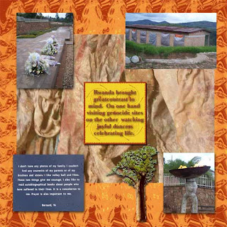
The second page features the local dancers at the museum. Both pages are made with the Africa kit from Sissy. The font is Long Island.

The second set of pages features Jacob's road trip to seminary. He took two weeks to enjoy himself. He stop in North Carolina and spent time with his friends there. He was met there by another friend from Texas who traveled with him to Chicago. The first page is scenes from Grandfather's Mountain.
The second page features scenes from the rest of the trip. Both pages use Racketty Scrappety's Template 22 a and b. The font is Perpetua. And the paper and elements are from DigiTreat's Jump collection.

And for those waiting for more freebies there will be another DigiTreat add on coming out soon plus I'm working on a kit based on day of fishing with the children.

Friday, August 29, 2008

CT Layouts for Girlfriend Designz


I've gotten another set of pages done for GF Designz. This time I used her Wild West Kit. As part of my duties I made a brag book page for her which she is offering on her blog. You can head over toe Girlfriend Designz to pick up your Wild West Brag Book page. These pictures are from our trip to the Greenmeadows Farm with our homeschool group. The font used is Calibri. I had a lot fun coming up with creative ways to use the different elements found in the kit to make some cute photo groupings. Hope you enjoy.

Monday, August 25, 2008

New Creative Team


I have been chosen for another Creative Team. For this one I'm working with Jenz at GF Design. Notice the new blinkie on the side. Click on to be taken to her blog. These two pages feature a two page layout with highlights of our trip to Williamsburg. I used the GF "Summer Escape" Kit to complete both pages.

Fun With Lisa Minor

I really enjoy working with Lisa Minor's from Scrapdebris. The price is really great too. Here are 3 layouts featuring her great layouts.

The first layout is from our field trip the hands on museum. It uses Lisa's "Ecclectic Coral" kit. The font is Tubular.

The second layout features one of our favorite places to visit. Hickory, NC. This layout use the "Abilities" kit.

The final layout features a day at the park with Mom and daughter. I used one of Lisa's great new kits "Awaken Her" from her Disney inspired collections.

Graduation Time 2006


I'm about half way through school year 2006. Yeah. Here are two graduation layouts. One from the Camp Fire Science program and one from college.

The first layout is from Camp Fire's Wacky Science program. Because my guys do this every year it gets harder and harder to come up with something fresh. So for this layout I focused on those very bright green shirts they wore. I matched this up with some great paper from Pam's DigiTreat Run set. I used the photo of the banner to serve as the title. Journal font is Heather.

The second layout feature's Jacob's undergrad graduation. (see a few weeks back for his master's layout to see if he's changed any.) Since this was for the school album I wanted a one page layout that would tell the story in a simple way. I used Heather for the title. The paper and most of the elements are from Queen Brat's Design. The Grad photo template is from Teri's Thing O My Jigs. I really liked the way this layout came out.

Friday, August 22, 2008

Doing Layouts for Crazy Diamond

Its so nice to have my computer backed up and running smooth. So while its raining again outside as Fay moves back over the state I decided to get some work done. I had two Crazy Diamond kits I needed to work on so I started with those today.

The first layout uses the Michelle Kit. I loved the texture of these soft pastels. The layout features all of us working hard to get Jacob's college graduation announcements out in the mail because he was still miles away in Africa.

The second layout features Crazy Diamond's Goofin' Around kit. These bright colors where fun to work with. This kits features some great Goofy accents which I didn't use as it didn't fit with the theme of the page but they are really cute. This layout features pictures from our field trip to Pizza Hut followed by fun at the park.

Friday, July 25, 2008

Layouts for the Crazy Diamond


Crazy Diamond has a great new kit called Believe. I created two very different layouts using this kit. The first layout is from Palm Sunday 2006. The font is Calligrapher.

The second layout is from an average day of doing school at Harbor Light Academy. The journaling font is CK Keystroke. The title font is Copper Plate and makes use of clipping a paper from the kit with the text.

I created my own journal boxes for both sets. I used parts of both kits and the add-on. Make sure it check it out its a beautiful kit and was fun to work with.

Well I tried ScribeFire and I like being able to move the pictures around but the way the pictures uploaded when you click on them you don't get a larger image which I don't care for. So I think the solution will be to upload and write on the regular blogger page and then reopen in ScribeFire and do any editing I want for the pictures and such.


WHAT HAPPEN TO THE FREEBIES:


And for those who have discovered my blog with my freebies I do plan on doing more. I would like to be able to post something at least once a week. I will continue to do things with the ADSDesign group, DigiTreat add-ons, and some of my own creations. I will be participating in a retreat in November as part of the leadership team which will mean most of my Saturday's will be taken up between now and then. So I need to come up with a different schedule to make time for scrapping, designing, school with the children, fixing dinner, and keeping the family in clean clothes. If I can prod the boys into taking care of the rest of the stuff I might just make it work. I will have a freebie August 1st as part of the ADS Design set. In the meantime I hope you enjoy my layouts.

Sorry I've been MIA


Things are going to be rather hit or miss over the next few weeks. My 17 yo who I suspect of having sensory issues for a while is finally having some more visible symptoms in the form of some muscle ticks. We have an appointment with my doctor in a couple of weeks. I think that this will be a blessing as we'll finally have something on paper that may help him get more help to complete his studies at the VoTech. But I have been gather medical records from his pediatrician, eye function evaluations, auditory evaluations, and hospital records from a head injury he had as a toddler. This will be the first time everything has been gathered into one package which I think will really prove to be beneficial.

In the meantime my 13 yo has expressed an interest in attending the local public military school for high school. Not sure how I feel about this complete but toward that end of making sure he's well prepared and well grounded before he goes off to a school setting I decided we need to change things up. So I've ordered some new things and as soon as it gets here I'll been spending a few days getting it input on the computer so he can get started as soon as possible.

So yesterday I decided I really needed to have a scrapping session. I actually got 6 pages done for our 2006 school album. I plan to show them off in pairs so this will be the 1st of 3 entries today.

This first layout today is a page to highlight Jacob's trip to Africa to spend a semester there as an undergrad student. I created the background paper myself using colors from the elements set I was using. The Elements are from An Anonymous Life's Etosha set. I took the Africa shaped frame and lowered the transparency and then tucked the photos up under it. I was in such a hurry that I forgot to right now which font I used.


The second layout is from our field trip to the National Weather Station in Ruskin, FL. It was a really interesting field trip. The paper is from A Work in Progress's Baby Boy set. And I again forgot to write the font down.